I’m writing this for Kristof, who splashed out on a Bamboo Pen & Touch. Aaah, I remember when I got my first Pen & Touch (and I invented Red Face out of frustration). Anyway, feel free to follow along as I run K-dog through some basics.
Ok so I’m going to assume you spent some time drawing a dude. Make sure there’s no gaps in your line work because it’ll make the next steps a lot easier.
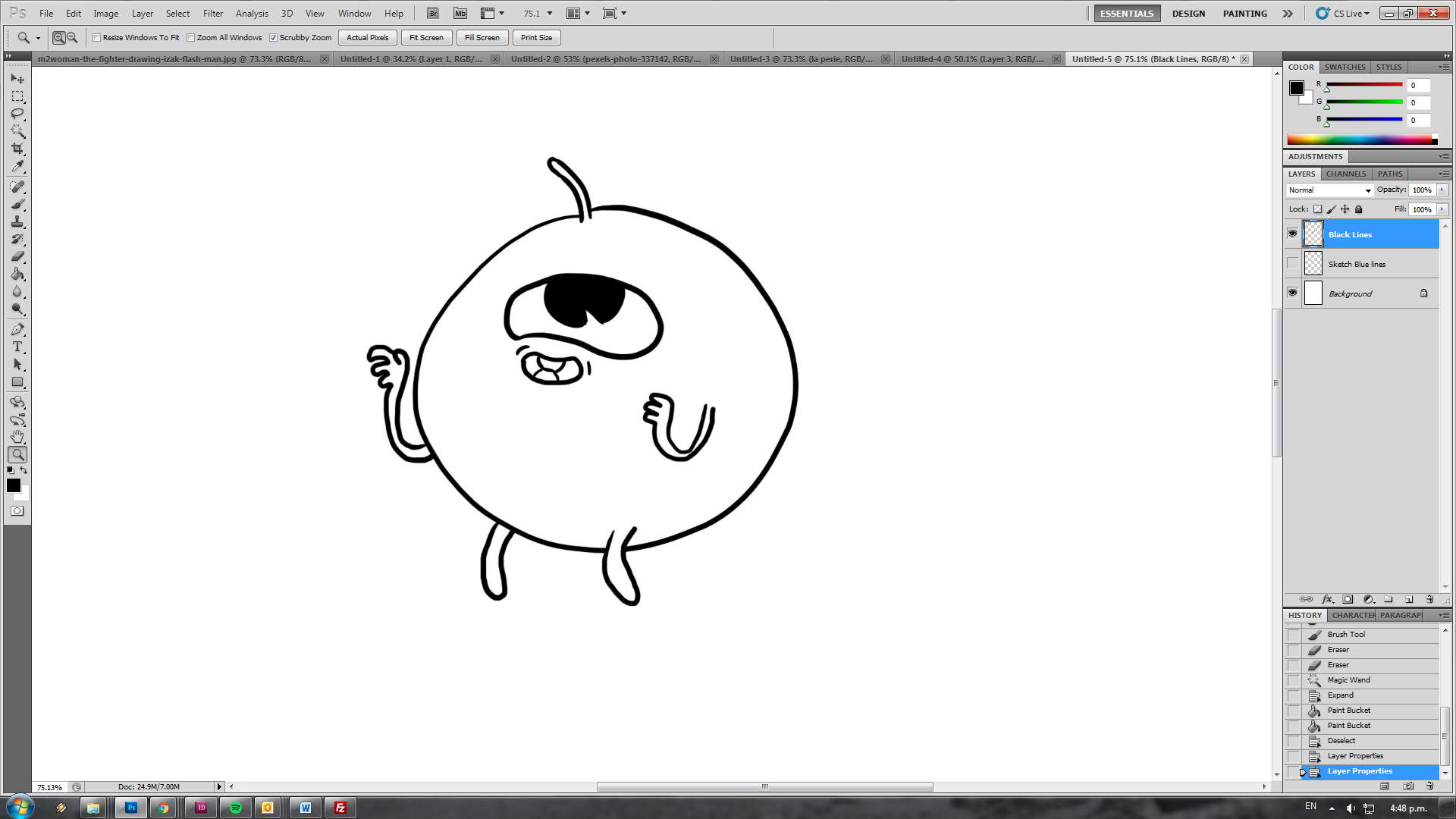
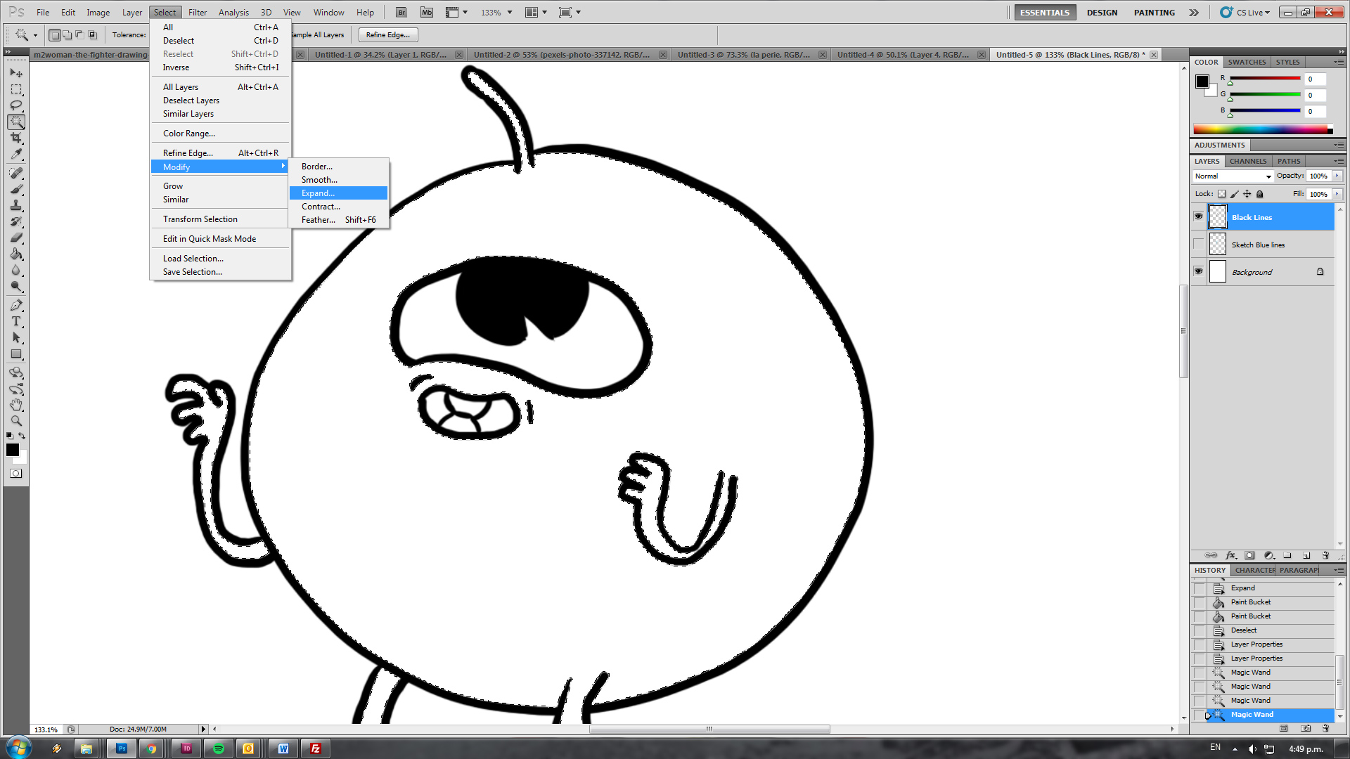
Aight, get the magic wand tool from the left hand sidebar and select all the interior of your dude.
Now if you colour dumped (onto a new layer of course!) you’d get this weird gross looking white gap between your linework and your colour. That sucks so I’m going to show you how to get around that.
While the marquee is still all selected go select/modify/expand. This expands your magic wanded selection. You can also contract and shit as well. I usually expand by 3 pixels, but sometimes this is too much depending on your line width. Good for an IZS strip though where we always use a brush size of 18.
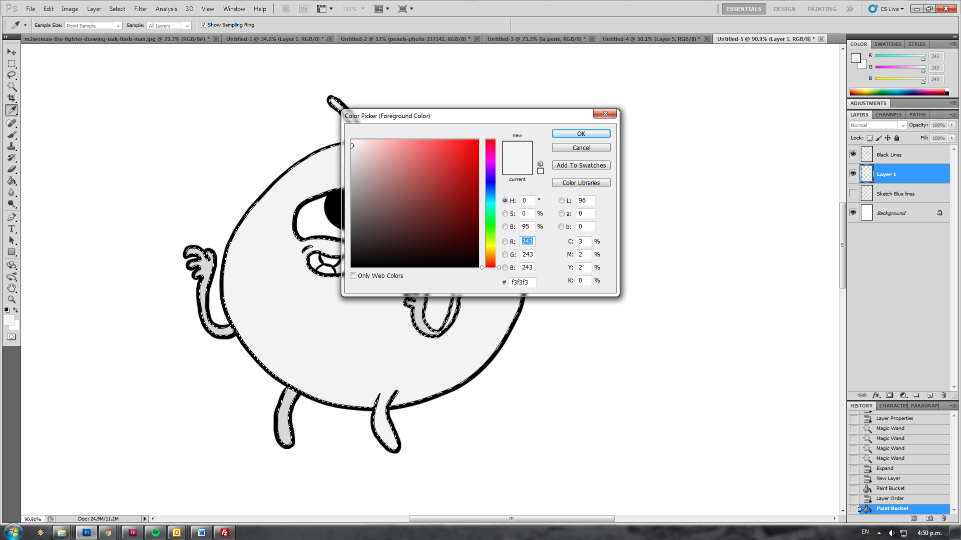
Now create a new layer below the line layer and dump some light grey in, this will be your base layer of colour. Note that the linework is overlapping the colour, no ugly white tracing around the edges, yay!
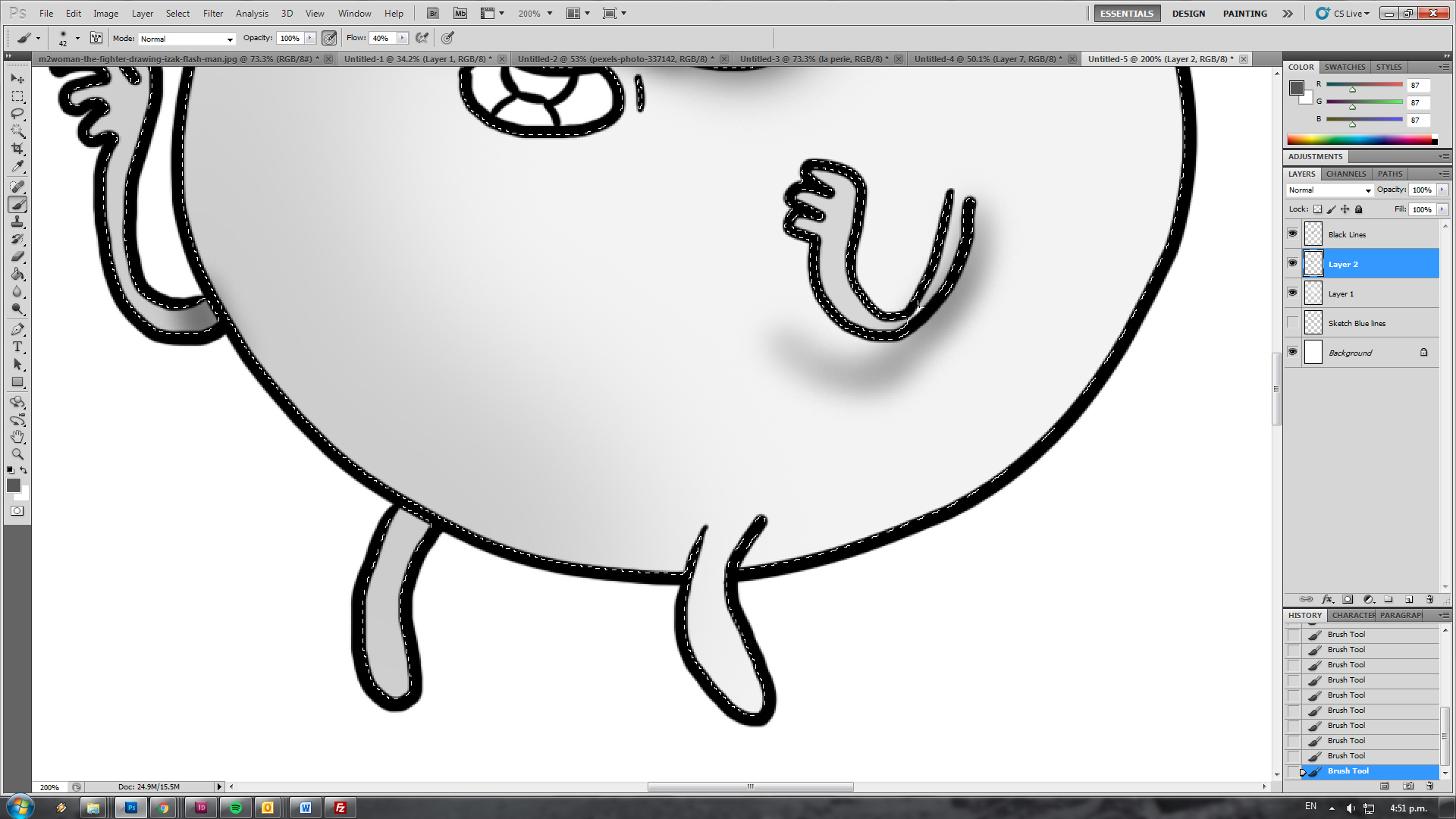
Now create another new layer, above your base colour (but still below your linework) and start shading that mofo. There’s plenty of ways to shade, just colour in black and white with the brush opacity set to pressure sensitive (top left header bar where you pick your brushes). I’ll let you find your own way to home.
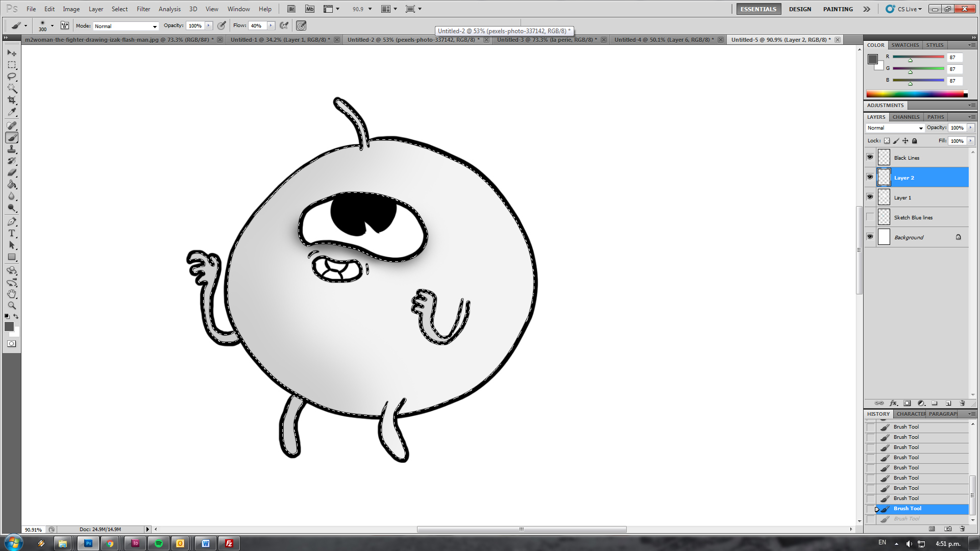
Now this is the part where I shouldn’t have done a ball shape because now you get to see how little discipline I use to shade things. I’m doing this at work, leave me alone. Anyway, adding details. Note that I haven’t unselected the magic wand stuff. This means I never paint outside the lines. If only I could have done this at primary school in RL I would have been a god of colouring in.
If you accidentally unselect you can hold ctrl and click on your base colour layer to reselect. Just make sure you work on your new detail layers so you can easily reverse your mistakes.
I’m pretty happy with this. If I’m adding more detail I’d add another layer and do highlights of white and stuff. But I’ve hardly shaded this dude anyway so I won’t bother.
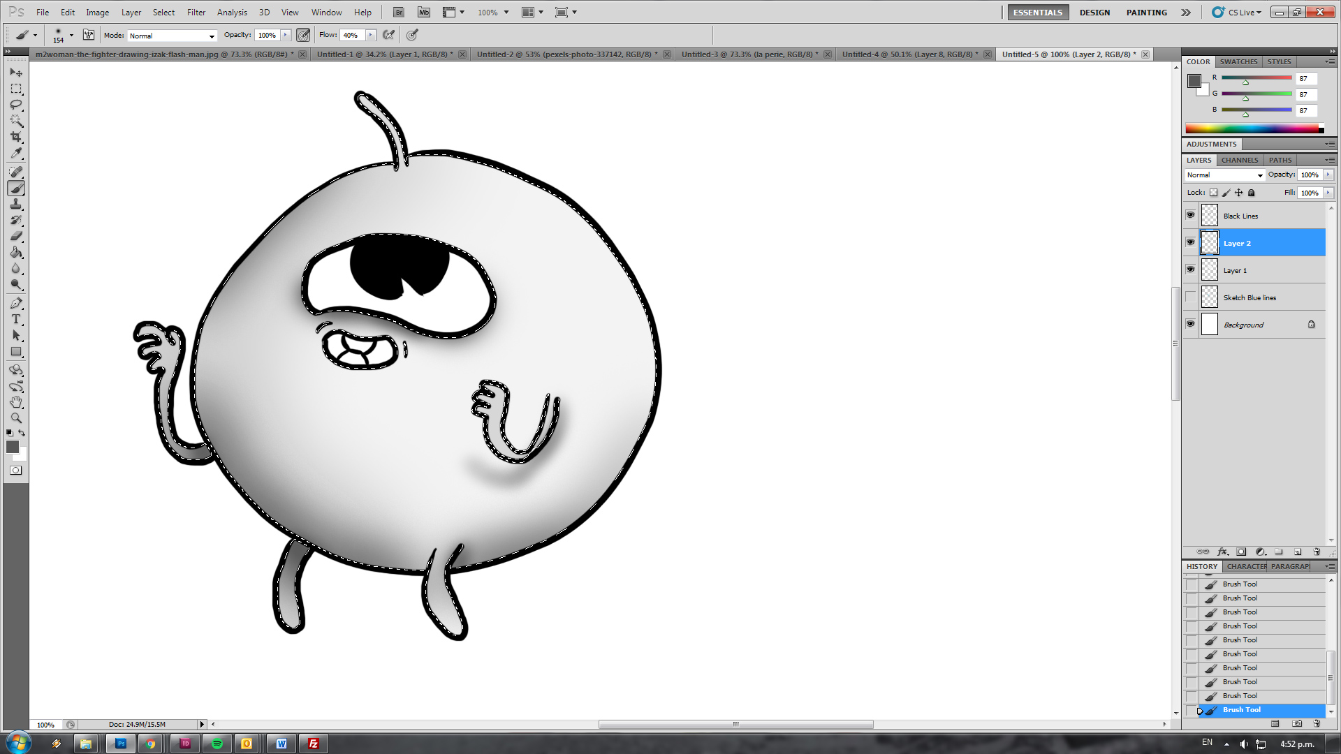
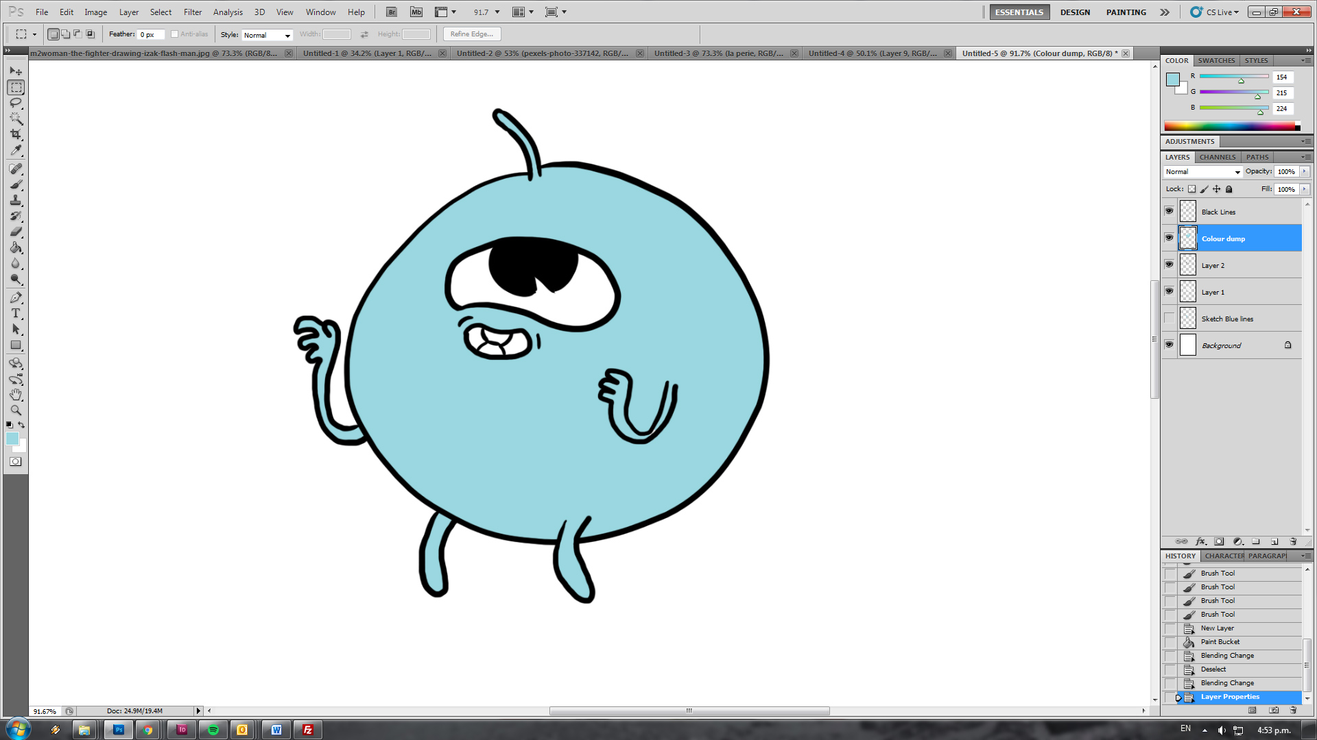
Ok, add yet another layer above all your detail work and paint bucket the shit out of it. All your beautiful shading is gone! Oh well. We’ll figure it out in the next step.
select your colour layer and now click that dropdown right underneath the layers tab. It’s the one that should be defaulted to “normal”. Now select “color” from the dropdown to make your blueberry look exactly like mine. Or “Multiply” if you want a dirtier look. In fact, experiment and flick through that list to see what sort of fun things happen.
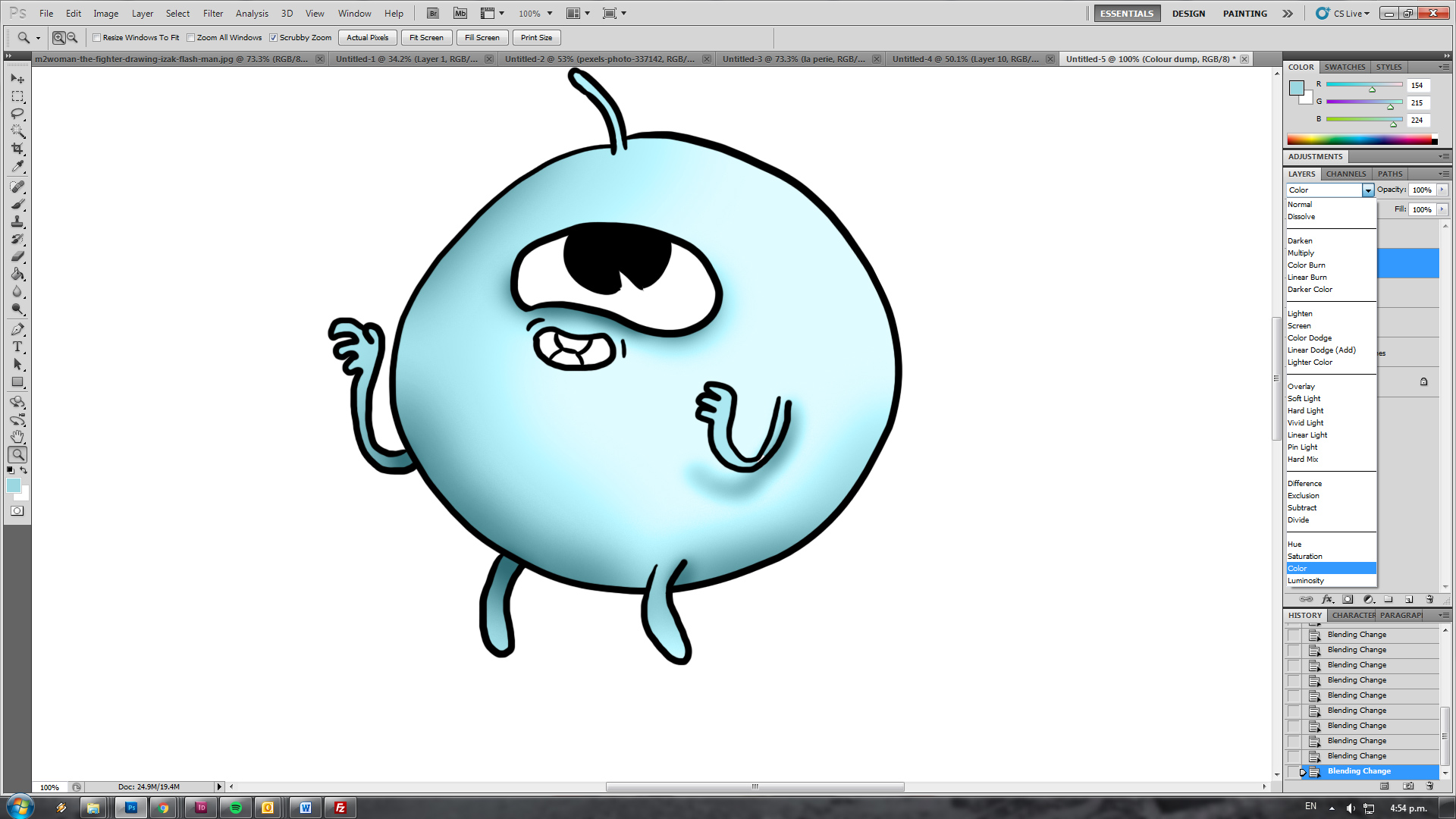
If you need things to be a bit more intense right click and duplicate your shading layers to make it all a bit more dramatic. Alternatively if you went ham on the shading of a particular layer select it and then turn down the opacity in the slider next to that dropdown I was making you dick around with just before.
Have fun! Get back to writing me scripts!
0 Thoughts on How to Shade and colour and shit, for noobs by noobs