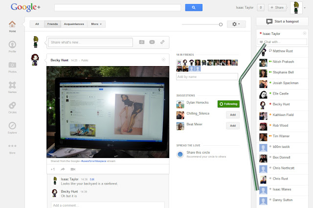
Last night Google decided to roll out a new G+ look. There are a number of things I don’t enjoy about it. But one thing I don’t mind is the “White Space”. The colloquial term for the negative space between the feed and the chat bar (which is strangely reminiscent of another social network which shall not be named, Voldibook.)
If you’ve missed it there has been a huge meme movement of derogatory images of people filling the white space with things, pot plants, bacon, etc.
I wouldn’t have done this post if it wasn’t for my comments in an earlier item about the subject of de-cluttering sites. More white space is good! If I could remove the chat bar I totally would. I don’t need that stuff. Perhaps I have less issue with this since I really don’t have any white space.
I realize I am in a quickly shrinking majority at the moment. My screen runs at 1280×1024. So I really don’t have any room to spare. While people running widescreens have tons. But really what is the alternative? Ads? Want some ads in there? Want another arbitrary feed of everything your friends are doing? Are you one of those people that thinks that this site here is a good example of how to take advantage of space? We shouldn’t fear negative space, and we shouldn’t hate change. Unless that change contains ads. In which case we should be upset that we are being monetized for using a free service that is run by people that have a good track record of sweet design.
Although I really don’t like the black bars it sticks on the sides of images if they happen to not be at an appropriate size for the post. It looks a little like an amateur powerpoint presentation.


Interesting. I'm on 1024 and I don't have a chat bar. So all you need to do to lose it is shrink your G+ window to below 1100 and you should be OK.
Oh wow, I didn't notice that. Wasn't expecting any responsive design in there for some reason.
That link to "this site here" is really helpful for my major research. 🙂 Thanks
Because it looks like a big ugly piece of junk mail?