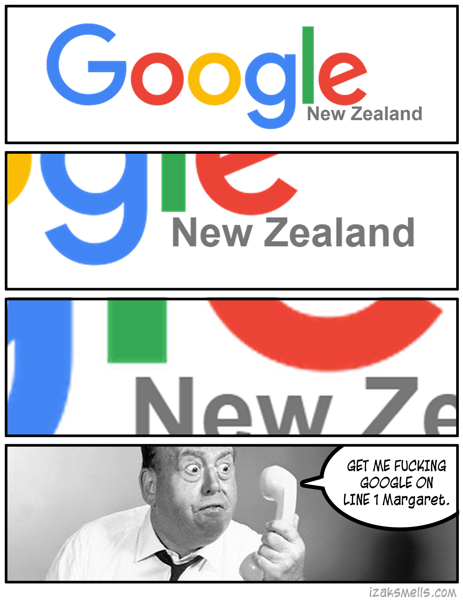
So it’s half of my job these days to look at shit like this. I’ve discussed it with the other designers in my life and we all agree. Line that country up with something Google! Ya getting sloppy with this roll out.
In fact it shoots all over the place. On the Chrome opener page it’s practically touching, while on the regular google.com page it’s got a little bit more space. Still not aligned to anything though. I know that they’ll fix it. I have faith.
In other news it feels totally liberating to do whatever I want with this part of the site.


0 Thoughts on Googles New Logo