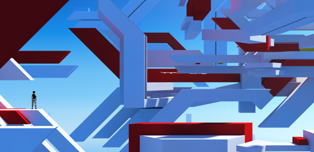
There haven’t been many articles I’ve read that have made me excited or passionate about something. I’ve just found one though. The articles have a distinct lack of bullshit, and are totally honest in their execution. The imagery is mind blowing, and that’s saying something considering I’ve been staring at this game for over five years now. I really didn’t think I’d see Mirrors Edge 1 in a new way any more.
It’s good to be hearing about someone that was a part of the team, to hear a bit of the backstory, and not just some CEO or marketer who only gives you the nice bits. This way feels a lot more human, like talking to someone who’s just done an amazing drawing but still says they hate it because something’s a little off and it will never live up to the amazing image that was in their head.
Even the site design is great. It’s one of the first I’ve seen doing the two column text grid. Weirdly enough it follows a couple of the trends I was experimenting with on my final design project at uni, Moxy. Two columns with wide images splitting the sections so the columns don’t get overly long. Drop caps at the beginning of a new section so people don’t get confused about where to start or how things are layed out. None of this lame “Go to Page 2” nonsense.
I had just assumed that the web design trend was going to stay on track with the overly large body copy single column stuff.
Obviously they’ve taken it to the next level with the 100% width of the article and better text size to take full advantage of any screen though. I’m sure if I was actually an intelligent web designer I might have considered that a better option rather than locking myself into specific widths which will only deprecate with time.
0 Thoughts on Faith In Journalism