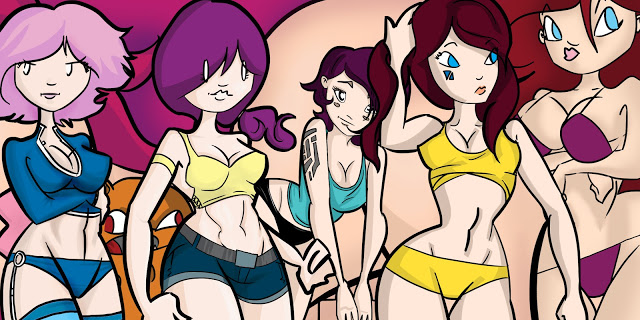
Well I have been feeling the tweaky itch of messing around with the blog. I decided against my better judgement to make the blog even wider than it was before so now it’s up to the 920 standard. Heck, it’s not as though I care what people on smaller screens are doing, I already got you a mobile version of my site. I needed to give it an extra 200 pixels because all the hips I draw are so wide they couldn’t fit in the regular format. And look at the pics in the previous post! Look how much space they have swimming around them now. I can make ’em BIGGER.
This site has always primarily been a place for me to show off my drawn work, and I really need more width if I want to do that properly. If I could find a decent way of getting rid of the sidebar without making the archives harder to get at then I would.
This shift also brings in a new version of the header and 1 point size up on the font. Also you can highlight things In a gaudy turquoise now! The font decision is clinging to the idea of what’s hypothetically the easiest row length to read, Which is about 12 words long. As you just counted, the rows are a bit longer than that, but I couldn’t bare pushing it up another point size.
So any comments or suggestions would be neato. If this is looking gross just tell me! You look at this more than I do… I hope.


0 Thoughts on Now Wider Than Ever